from Hacker News

Why are hyperlinks blue? (2021)

by redbell on 10/2/25, 8:13 PM with 63 comments

  • by patel011393 on 10/5/25, 7:13 PM

    They're blue because computer scientist Ben Schneiderman made them blue using research from 1985:

    " In 1985, a group of students at the University of Maryland, mentored by computer science professor Ben Shneiderman , conducted a series of experiments to study the impact of different hyperlink colors on user experience. They were eager to determine which color would be the most effective in terms of visibility and readability.

    The experiments revealed interesting findings. While red highlighting made the links more noticeable, it negatively affected users' ability to read and comprehend the surrounding text. On the other hand, blue emerged as the clear winner. It was dark enough to be visible against a white background and light enough to stand out on a black background. Most importantly, it did not interfere with users' retention of the text's context."

    Mozille should really do better research before posting histories like this. It's easy to overlook the impact of academic research in tech.

    Source:

    Barooah, S. (2023, June 09). Why Were Hyperlinks Chosen To Be Blue? Retrieved from https://www.newspointapp.com/english/tech/why-were-hyperlink...

  • by crazygringo on 10/5/25, 8:01 PM

    So Mosaic did it in 1993.

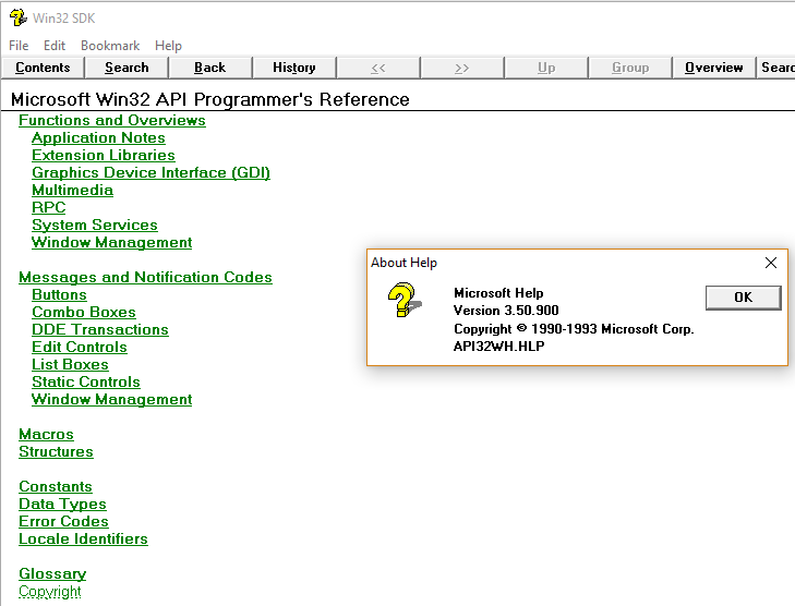
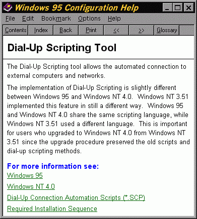
    I could have sworn WinHelp [1] (the help viewer built into Windows 3.0) did it in 1990, but looking it up it turns out their hyperlinks were dark green. My memory had changed them to blue retroactively...

    A couple of images:

    https://virtuallyfun.com/wp-content/uploads/2018/08/WinHelp-...

    https://www2.isye.gatech.edu/~mgoetsch/cali/Windows%20Config...

    [1] https://en.wikipedia.org/wiki/WinHelp

  • by drob518 on 10/5/25, 9:32 PM

    I suspect it’s for the same reason that the two most popular pen colors are black and blue. On light backgrounds, blue shows up well and doesn’t impede readability. So, if all your text is black by default and you want another default color that is also readable, blue’s an obvious choice. Add underlines for users working in grayscale environments.
  • by mrandish on 10/5/25, 8:20 PM

    One thing worth mentioning as a possibly-contributing factor was that in the very early 90s a lot of the installed base of high-res (eg non-interlaced) color monitors where still digital RGB (RGBI) which were limited to 16 colors (and often just 8 colors in two intensities each). In many palettes the 8 base colors were black, white, red, green, blue, cyan, magenta and yellow. So, there weren't a lot of colors to choose from. CRTs had RGB primaries so cyan, magenta and yellow weren't generally as legible for single pixel width lines (ie text).

    I also always assumed part of the choice of blue was that in many locales red, yellow and green have connotations of stop/alert, warning and go/okay (respectively) - whereas blue was relatively more agnostic. So... if you're targeting the widest installed base of displays, out of the lowest common denominator choices available blue was pretty much the obvious remaining choice.

  • by bertili on 10/5/25, 6:43 PM

    Blue was by far the easiest on the eye compared to Red, Green, Yellow, Cyan, Purple, on a white background, on old CRT monitors.

    The more interesting question is why were backgrounds white rather than black?

  • by suhail on 10/5/25, 6:44 PM

    I actually asked Marc Andreessen this question a few years ago while making a browser.

    Me: “why did you decide to make links blue?”

    Marc: “I sure as hell wasn’t going to make them pink.”

    Me: “what about green?”

    Marc: “ew”

  • by p0w3n3d on 10/5/25, 6:55 PM

    What I am fairly sure at the moment, is that they no longer are. People are doing everything possible to NOT make them blue, which something makes them very hard to find
  • by ChrisArchitect on 10/2/25, 8:16 PM

    a weak clickbait-y post from 2021 that didn't even really answer its own question etc.

    Discussion: https://news.ycombinator.com/item?id=28315934

  • by GuB-42 on 10/5/25, 7:55 PM

    Starting from a white background, what other color can it be?

    It has to be a dark color, and blue is the darkest of the primary and secondary colors.

    With 16 color displays typical at the time, you can use one of the 8 remaining "half brightness" colors. Dark red is still red, and red tends to mean that something is wrong, which is not the message here. Dark blue and grey do not provide enough of a contrast. Dark yellow and dark green look ugly, they use it in generic cigarette packaging for that reason. Dark cyan could have worked I guess, but that's still a shade of blue, so you might as well just use blue.

    Go beyond the VGA standard 16 colors and many computers of the time may not render it correctly.

  • by mikeryan on 10/5/25, 7:02 PM

    They’re blue because Marc Andreesen liked blue.

    https://www.instagram.com/reel/DPO0A7dDvFm/?igsh=NTc4MTIwNjQ...

  • by dang on 10/5/25, 8:05 PM

    Related (including alternative answers):

    Revisiting why hyperlinks are blue - https://news.ycombinator.com/item?id=29897811 - Jan 2022 (60 comments)

    Why are hyperlinks blue? - https://news.ycombinator.com/item?id=28315934 - Aug 2021 (255 comments)

  • by rappatic on 10/5/25, 9:15 PM

    Intuitively it makes a lot of sense. Red is obviously associated with “bad/stop/destructive” and green with “positive/go” while blue is neutral in this respect. The other colors aren’t primary and they have their own problems: orange is too similar to red and yellow is too hard to make out against a white background. Purple is okay which is why it’s used for “visited” links but it’s much less ubiquitous than blue in everyday life which makes it gaudy/distinctive.
  • by the_mitsuhiko on 10/5/25, 8:31 PM

    There is a video of marc andreesen going around where that question given to him: https://x.com/mrexits/status/1956237638878552418
  • by nftu on 10/5/25, 7:35 PM

    As a red-green colorblind person, curse the person who decided visited links should be purple.
  • by yzydserd on 10/6/25, 8:24 AM

    No mention of the Amiga? Amiga Guide is a hypertext format, first released around 1992 with Workbench 2.1 I think, with Blue highlighting, again if memory serves, inherited from the OS theme.
  • by agiacalone on 10/5/25, 11:21 PM

    I’m pretty sure that Gopher was only “Green on Black” because many of the terminals used to display them (ie. DEC’s VT220) used green phosphors.

    If you had a white phosphor terminal, it would have been White on Black.

  • by ghssds on 10/5/25, 9:41 PM

    Microsoft's EDIT, QBASIC, QuickBASIC and MSDOS 6.x had on-screen help in the form of hypertext documents with white links inside green brackets on a black background. It looked good. Windows 3.1x also had on-screen help in the form of hypertext documents with underlined green links on a white background. It also looked good. They cherry-picked their examples by talking about Windows 3.1 without mentioning that. First time I experienced the world wide web, it was using NCSA Mosaic and it featured blue hyperlinks instead of green, which was a surprise.
  • by aatd86 on 10/5/25, 8:55 PM

    So did Marc Andreessen take undeserved credit or not? That's what I want to know...
  • by zkmon on 10/5/25, 7:11 PM

    That's like reading about evolution of internet browsers. I witnessed the stuff since around 1991. I suspect the W3C and other standards bodies such as IETF might also have had some role in the matters of rendering the HTML markup. Ofcourse Mozilla was also a dominant player in shaping things up in this space.
  • by ivankelly on 10/5/25, 9:48 PM

    They’re blue because pmarca was a democrat back then